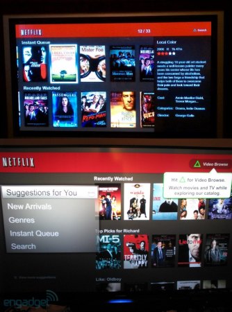
From the time the native Netflix App launched for the PlayStation 3, there have been numerous account of two to three different types of interfaces appearing for users. When a PS3 owners would scroll to the movie section of the XMB (Cross Media Bar) on their PlayStation 3 console and launch the Netflix App, they could never actually be sure what version of Netflix would appear. Some speculated that old versions were still in the Sony servers and this was caused by them while others thought this might be a glitch from Netflix. Now, we have the answers, straight from Netflix and it’s neither of those scenarios.
Chief Product Officer Neil Hunt recently addressed the issue, stating that Netflix is indeed providing three different designs for the PlayStation 3 users. The idea is to cycle between the simplicity and a full blown complete application, to gage peoples taste and understand how they find their media. Neil went on to say;
We explore such basics as play and add-to-queue button placement, size, and functionality. We tested the switch last year of whether the home page should be DVD or streaming focused.
This is all great and all but to use PlayStation 3 owners as just a test subject and not actually give them a choice on the matters seems a bit disingenuous. It would be great if users could opt in to this test program or just choose a single UI to stick with, instead of playing a game of chance, every time they boot up the Netflix app. At least the mystery is now solved.
[Via Quora]

You must be logged in to post a comment.