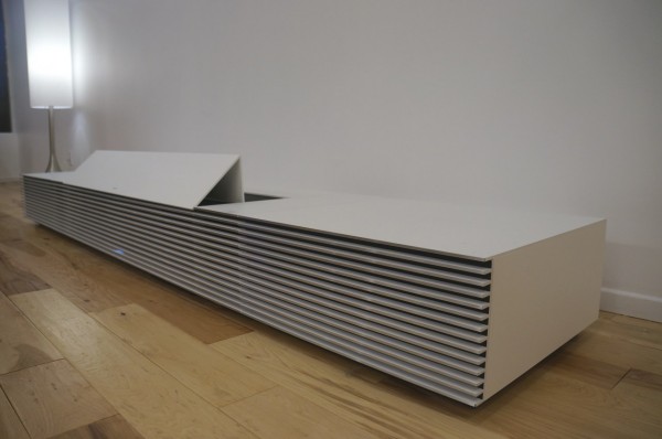
When the Sony 4K Ultra Short Throw Projector was revealed, many (including) us marveled at its design aesthetics and 4K picture quality which can be displayed up to 147 inches. From first glance, it’s obvious that Sony took a radically different approach to designing it and that’s due to their new Life Space UX, which aims to improve technology’s ability to complement any decor and stand out less, giving way to the experience. Originally, it was believed that, because of this achievement, including 4K and alternative design, the Sony 4K Ultra Short Throw Projector housed a large form factor but after some digging, we’ve learned that the size is a function of design with other components mixed in as opposed to a form factor that is meant to disguise a bulky set of components.
The breakdown of the design and hidden compartments awaits you after the jump.

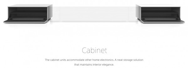
As you can see from the image above, the Sony 4K Ultra Short Throw Projector itself is actually small and in line with sizes of other projectors. In fact, due to its utilization of laser versus bulb, Sony has been able to keep a fairly compact design. From there, the projector is surrounded by two speakers and two cabinets which give it the extended look. The aluminum cabinets are also fully functional and open towards you to reveal their storage space.

When turned off, the projector cover will automatically dip back down to create a clean line across the entire piece. It remains to be seen if Sony will offer the 4K Ultra Short Throw Projector in any other colors during launch, which will take place in late Summer. Those looking for larger pictures can browse our gallery below.
Discuss:
Do you find the Sony 4K Ultra Short Throw Projector aesthetically appealing?


You must be logged in to post a comment.