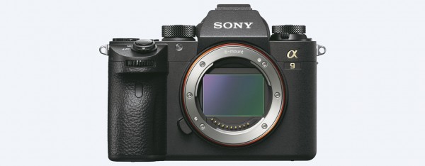
Despite being a year old, quite a few of you were happy to see the video review piece on the a6300, a fantastic mirrorless camera by all accounts. Still, there is even a better camera in my opinion that doesn’t break the bank, but offers a whole lot more – the a6500. Released nearly 6 months after the a6300, the a6500 offers subtle improvements in all categories, including design. Here is Matt Golowczynski from digitalrev:
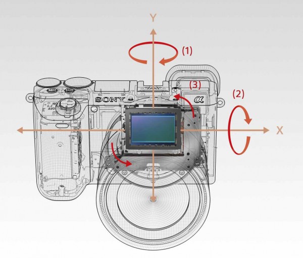
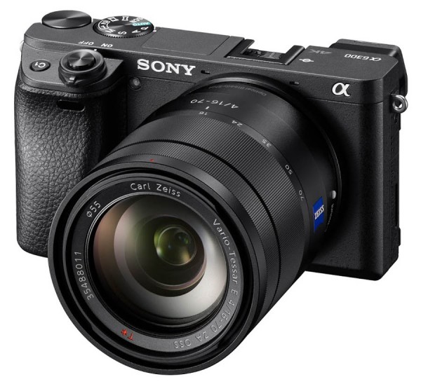
The two models have a very similar form, with the a6500 just being a touch heavier and thicker (which appears to be at least partly down to a new image-stabilisation system, covered below).
The a6500’s grip has been restyled, while the shutter release button appears to be slightly larger too. The a6500’s command and mode dials now also share the same finish around the sides, which wasn’t previously the case.
Another change that’s not as easy to appreciate is that the eyecup on the a6500 has been redesigned to be slightly softer than the one on the a6300.
There’s also been a small shift in the physical controls on the newer a6500. The customisable C1 and C2 buttons, which on the a6300 were found on the top and rear plates respectively, are now both found on the a6500’s top plate.
Additionally, and a third C3 button is twinned with the delete button, exactly in the same place as the a6300’s C2 button.
Though perhaps all minor tweaks, for serious photographers and videographers (which I’m not), placement of buttons and how they feel can be the difference of being able to use the camera for countless hours and being continuously frustrated by it.





You must be logged in to post a comment.