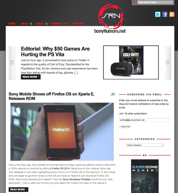
After a year-long design process and nearly 6 months of building and testing, I’m proud to unveil our new website to all of you. Long-time readers will note this as our third major design shift since 2008. Back then, the site resided on a simple black background and one top header with a bit of red in the mix. Our second design shift happened in late 2011 (pictured above), which brought our design philosophy a major step forward. Our design then offered a mobile theme for the growing transition towards mobile consumption while our main theme continued our brand color of red and black. The site during that time had equally matured with a sliding feature section and more back pages like our About Us, Careers, and Tips page. While each iteration of the site got us one step closer to a more content rich-website, each site also had a fair share of issues. Since the previous two themes were not built from the ground up for us, much of the work relied on tweaked codes which resulted as a coat of fresh paint on an archaic infrastructure.
Enter SRN 3.0 (as it’s been internally called), designed entirely from the ground up for us. While the concept is not entire original, every single design decision (for better or worse!) was made to offer a more robust experience for you. Exploring our back pages like our Editors Page and FAQS etc. will reveal a slightly modified layout that pushes the noise aside and brings the material front and center. The top of the website now houses an array of social media links for you to connect with us, while we’ve moved from a one sidebar design to a duel sidebar layout. While there was a lot of debate between the number of sidebars for the site to house, I ultimately went with two sidebars to better separate the material from the advertisements. This makes navigation easier for readers and allows for prominent ad placement for our advertisers without sacrificing the two or blending them in for a jumbled mess of content.
Since 2011, the mobile market has grown exponentially and readers have continued to demand a more sophisticated approach. Generally, websites choose to lock mobile readers in desktop mode which offers more content, but can be harder to navigate, or readers are forced in mobile view which can be more content rich, but tends to lack desired features. This feat only becomes tricker as the number of mobile devices with different resolutions and screen sizes grows. The solution? A fluid design. Our site no longer picks and chooses between one version or the other. Instead, our content will morph to any given screen size out there. Don’t have time to test it on your mobile device? Just grab the corner of your browser and maximize or minimize the screen by dragging on the window corners and watch the website morph. In fact, for the true mobile experiences, say on an iPhone 5, the site pushes the sidebars, the top social media icons and purely offers you the articles to read which still offer all the features that our normal site would. In fact, the website was built with touch in mind as you will discover with our menu system and galleries which come to life and fully navigate as you would expect them in a touch environment.
In 2013, our goal for the website more than ever is to connect with you and offer you the news and content that you care about. So I encourage you to check out our Editors Page and get to know and socialize with our staff. Have an opinion on something? Let us know in the comment section of our articles and remember that you can find us on Facebook and Twitter to further continue the conversation. Speaking of opinions, let us know what you think about our new design in the poll below; if there are any specific things you’d like to see, let us know in the comments section after the jump.
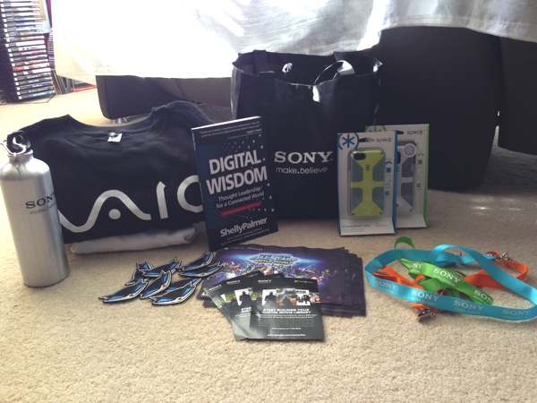
Starting tomorrow, Saturday, March 2nd, we will be holding a contest on Facebook and Twitter that will help you get better acquainted with our redesign. We’ll ask you questions about the site (find the answers on the front page or in the back pages!), Sony, and PlayStation. The best part? The first person to answer correctly will receive an awesome gift from our bag of loot! We can’t wait to get started. Join in on the fun by liking us on Facebook and following us on Twitter! See you there!


You must be logged in to post a comment.